


SBUX Scheduled Ordering
Designing Scheduled Ordering for Starbucks Partners
Scheduled Ordering is a new feature designed to give Starbucks partners the visibility and control they need to manage future-dated mobile orders. As the Mobile Order & Pay (MOP) ecosystem expanded, it became clear that baristas lacked insight into when and how these scheduled orders would appear—leading to confusion, misfires, and operational strain. I was brought in to help design a solution that brought clarity and trust to this emerging order state.
Role: Product Design, UX Strategy, Cross-Team Collaboration
Scope: Partner-Facing Tool (Retail Operations)
Timeline: MVP launched 2025
Tools: Figma, Jira, Confluence, Usability Testing
The Challenge
Partners were essentially “chasing waterfalls”—trying to keep up with a growing stream of scheduled orders without context or control. Our goal was to design a tool that would:
Surface actionable insights at the right moment
Reduce manual guesswork and increase order flow confidence
Integrate smoothly into current production and handoff processes
Ensure accessibility from day one

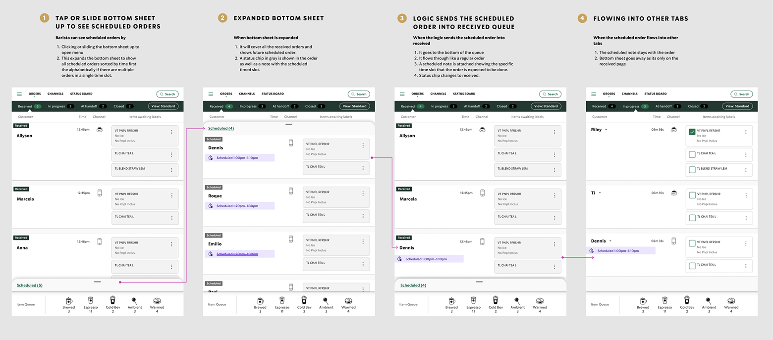
Simplifying complexity
Creating a seamless group of orders with a complex backend to give the barista enough information at the right time.
My Approach
Learn, Adapt, React
I began by catching up on the broader MOP roadmap and understanding what data needed to be surfaced in our Daily Production Manager (DPM) tool. From there, I aligned with product and engineering teams to define realistic MVP goals—while still pushing for design excellence.
Explore & Test
Concept: Sketched and prototyped three early concepts with clear visual hierarchy, flexible filters, and system status indicators.
Accessibility Considerations: Brought in A11y early in the design phase to catch potential issues up front and reduce rework later
Team Feedback: Collaborated with the FMO UX team for feedback, critiques, and direction refinement.
Prototype & Validate: I developed a mid-fidelity prototype that walked through all order states and interactions related to scheduled orders. Because this was a net-new feature, it was critical to show baristas exactly how it would behave from entry to handoff.
Usability Testing: Partnered with Research to test the prototype with 10 partners (6 Tryer store, 4 learning stores). The insights were invaluable—surfacing friction points and validating what felt intuitive to partners.
Key Refinements
Adjusted the scheduled order chip color from burnt sienna to a more neutral gray to signify an inactive state
Reworked the bottom sheet layout so it wouldn’t fully cover the received orders list
The Solution
Launched an MVP that included:
A new Scheduled order state clearly labeled and styled
Contextual visibility within the DPM tool without interrupting the normal order flow
A subtle but accessible design language that balanced urgency with simplicity
A system of manual levers and order filters to give partners more confidence and flexibility
The Impact
Received positive feedback during testing from all 10 partners—100% felt confident using the new design as-is
Improved partner trust in the system by introducing visibility into scheduled order timing and volume
Set the foundation for long-term enhancements to the partner-facing ordering dashboard
What I Learned
Speed and quality can coexist when the team shares a clear, common goal
Early inclusion of Accessibility can save significant time and create a better user experience for all
Listening to frontline users unlocks valuable insights that specs alone can’t surface