


SBUX Retail Design System
Building the Starbucks Retail Design System
I led the creation of a unified retail design system for Starbucks to serve as the foundation across all partner-facing digital tools. With multiple teams designing across a growing ecosystem of operational products, we needed a scalable solution that would reduce redundancy, speed up development, and ensure a consistent, accessible experience for baristas and store managers.
Role: UX/UI Design, Design Ops, Research
Scope: Internal tool
Timeline: Ongoing
Tools: Figma, React Native
The Challenge
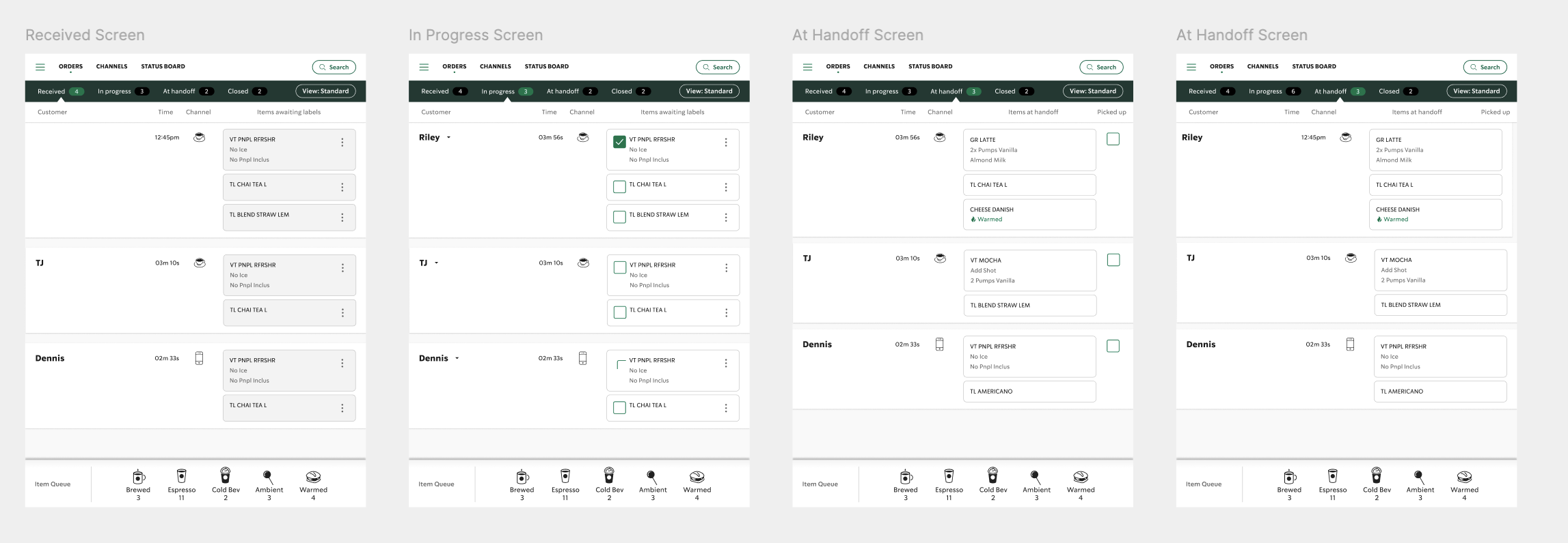
The lack of a shared design framework had led to inconsistencies in UI patterns, visual language, and interaction behavior across partner tools. This created confusion for end users, misalignment across product teams, and inefficiencies in how designs were created, reviewed, and built. The opportunity was clear: build a flexible, evolving design system that could serve every team and every tool in the Starbucks retail portfolio.
My Approach
I focused on building a system that balanced structure with flexibility. The process included:
Auditing existing products to identify inconsistencies and redundant UI patterns
Collaborating with cross-functional teams to define shared standards and components
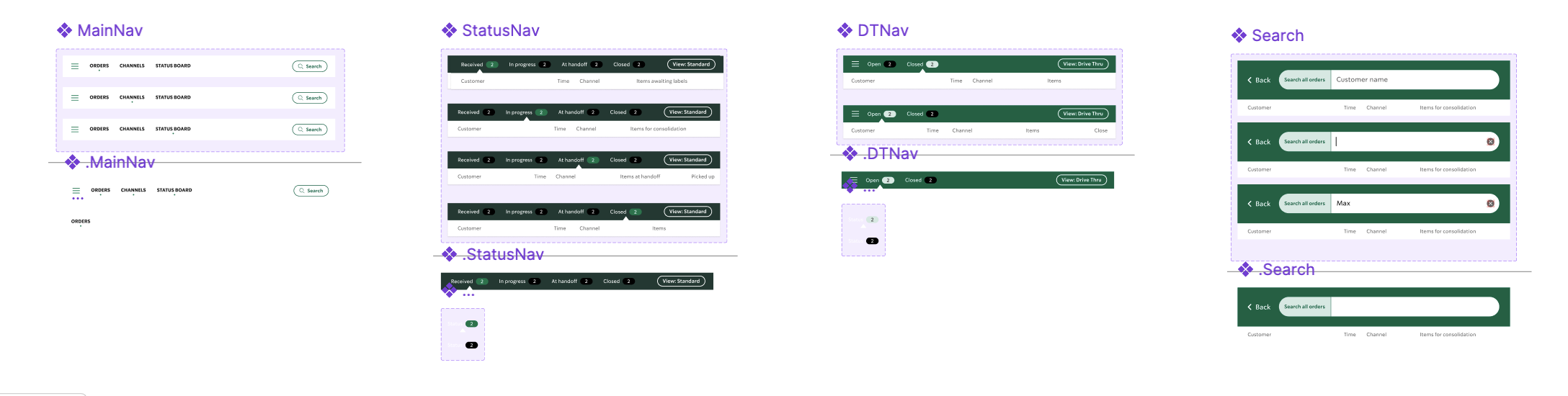
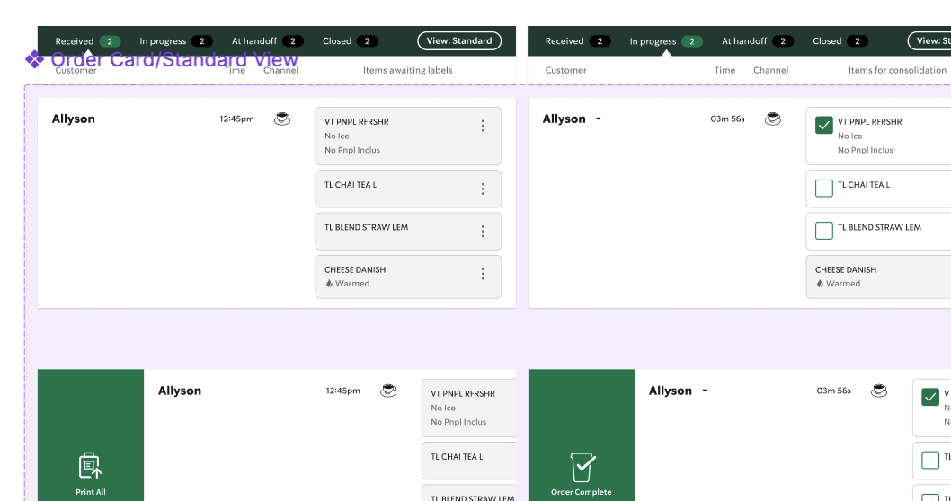
Creating a comprehensive library in Figma with modular components, color tokens, typography, spacing, states, and interaction patterns
Documenting best practices, usage guidelines, and accessibility specs for seamless adoption across design and engineering
Evangelizing the system to product teams and leadership to encourage adoption and long-term sustainability
Key Goals
Consistency & Efficiency: Reusable UI components reduced design and dev time while ensuring a unified look and feel across all tools
Collaboration: A shared design language minimized confusion between designers and developers, improving handoff and accelerating delivery
Scalability: Built a flexible system that adapts to new features, tools, and use cases across the retail product landscape
Accessibility: Integrated inclusive design principles to meet WCAG 2.1 standards and create better experiences for all users

The Impact
30% reduction in time-to-design for new feature work
Faster design reviews and fewer QA issues due to standardized components
Increased design system adoption across multiple pods supporting partner tools
Stronger brand presence and more intuitive interfaces for store partners
Onboarded new designers faster with clear documentation and reusable assets
What I Learned
A design system is not just a library—it's a product that requires governance, iteration, and community
Early cross-team alignment makes adoption smoother and helps avoid fragmentation
Investing in structure frees teams to innovate, rather than reinvent