


SBUX Label Redesign
Redesigning Starbucks Labels for Clarity, Efficiency, and Connection
Labels are a foundational piece of the Starbucks in-store experience, used to produce, fulfill, and identify over 12 million orders per day. Over time, the original label system that was introduced in 2014 has struggled to keep up with evolving store operations, partner needs, and customer expectations. I helped with the redesign of the Starbucks label system to solve for operational clarity, customer experience, and brand alignment.
Role: Product Design, Cross-Functional Collaboration
Scope: National Rollout
Timeline: FY24-25
Tools: Figma, Jira, Confluence
The Challenge
The original label design was falling short in three core areas:
Partner workflow friction: Difficulty reading modifier instructions and grouping orders accurately
Customer confusion: Orders were hard to identify due to lack of clear visual hierarchy
Brand mismatch: The labels felt outdated and disconnected from Starbucks' visual language
With millions of labels printed every day, even minor inefficiencies added up quickly in both labor and customer experience costs.
Make it stand out!
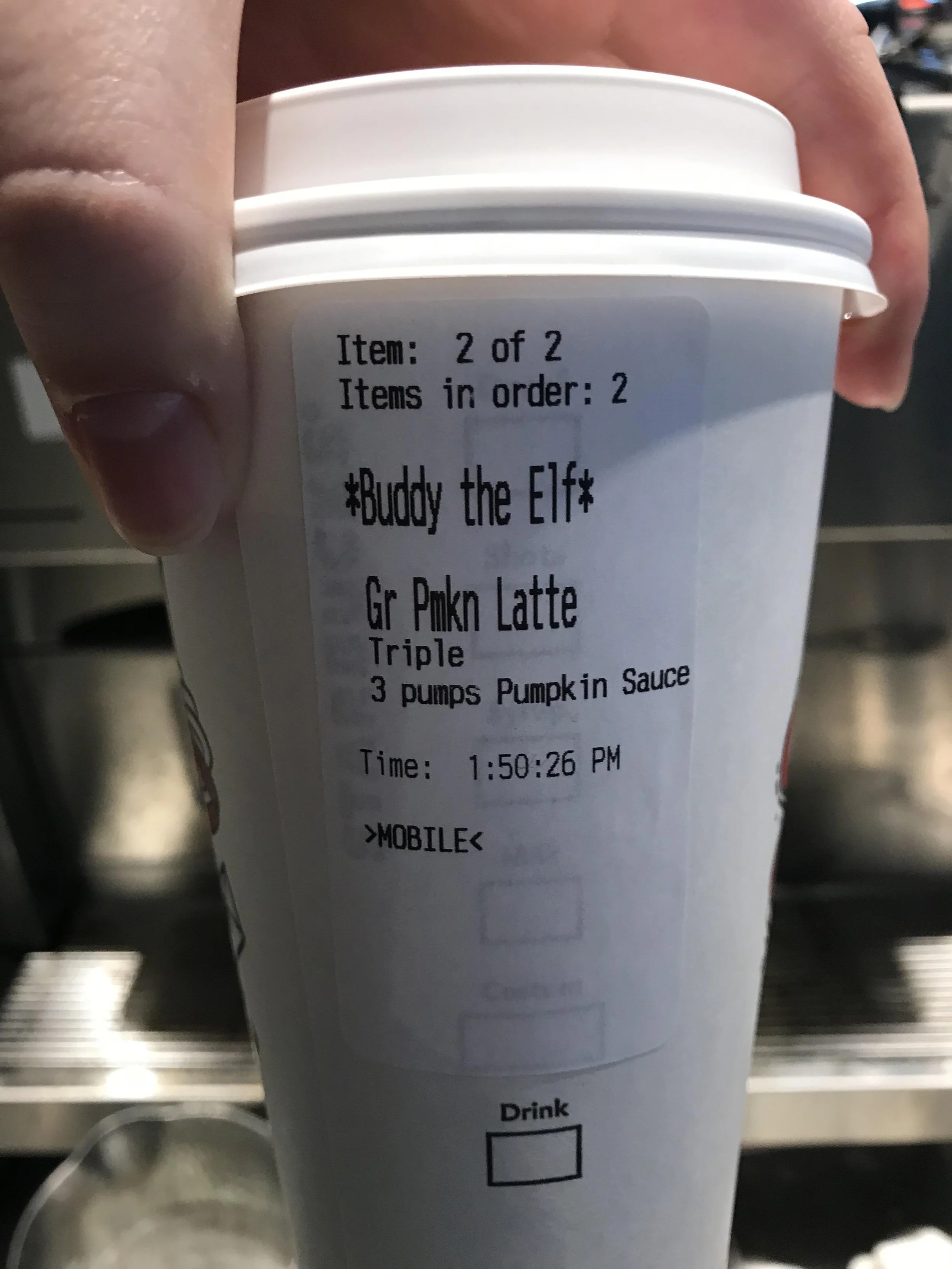
What is the UX of the original label and what challenges does it need to provide to the barista and customer.
My Approach
Collaborated across teams: Worked closely with Retail Ops, Store Experience, and FMO Portfolio to capture partner and customer pain points
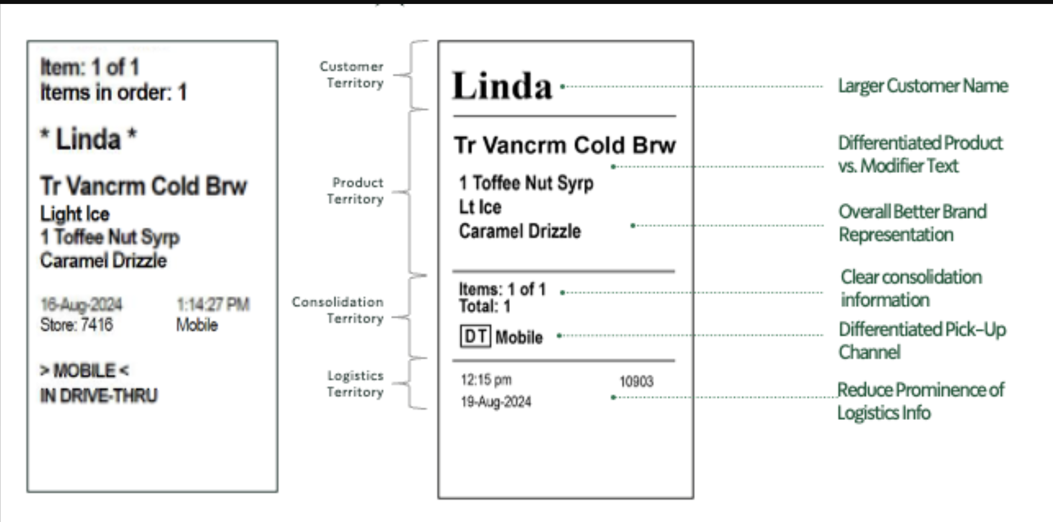
Redesigned for clarity and hierarchy: Introduced a bold customer name, visually distinct product groupings, and improved typography for modifier instructions
Prototyped and tested in context: Rolled out the new label design in 1,500 stores to validate improvements with real-world usage
Iterated based on feedback: Paused national deployment to address partner concerns—then re-tested and launched with refinements.
The Solution
The updated label system now supports:
Partners: Easier order consolidation, clearer modifiers, and less cognitive load during peak rush
Customers: Faster order identification, reduced handoff errors, and a more polished experience
The Brand: A refreshed, aligned visual system that supports trust, efficiency, and familiarity
The Impact
Post-redesign testing across 1,500 stores revealed significant support:
85% of partners preferred the new label over previous versions
89% of partners agreed (or were neutral) that it addressed prior concerns
86% of partners agreed (or were neutral) that it improved ease for both partners and customers
Improved order accuracy and reduced handoff friction noted in qualitative feedback